























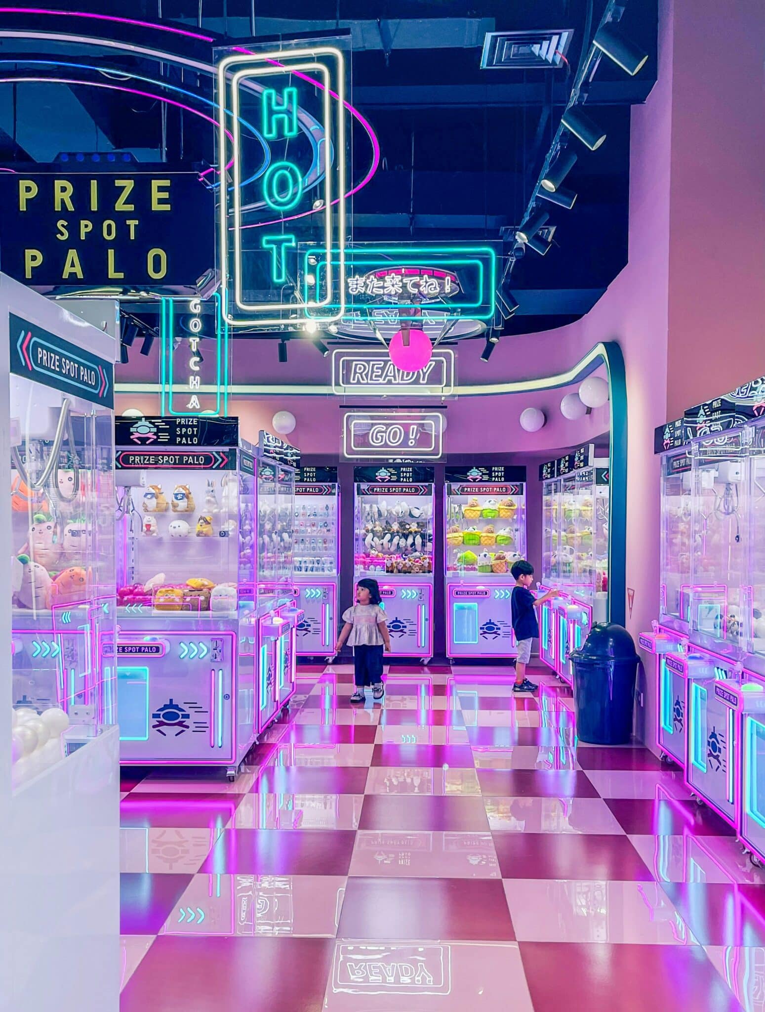
On September 11, NQ64 launched its largest location so far: a two-story space at Orange Yard on Manette Street in Soho, filled with Pac-Man machines, pinball tables, and Nintendo 64 consoles set to free play. The arcade bar group started in a Manchester Northern Quarter back alley in 2019. Now operating across the UK, it has kept its style largely the same. Neon artwork and graffiti still cover the walls.
Across Soho, Piccadilly Circus went the other way. Landsec, which owns the site, says LED displays had completely replaced its neon by 2011, and in 2017 the junction switched to a single curved 4K screen. So London’s most famous illuminated corner retired neon as old technology, while a fast-growing leisure brand built its identity on the look. Neither call was wrong.
Join The European Business Briefing
New subscribers this quarter are entered into a draw to win a Rolex Submariner. Join 40,000+ founders, investors and executives who read EBM every day.
Subscribe
Neon signs keep winning in nostalgia-led branding because the glow signals a past era before anyone reads a word. LED versions now deliver that signal cheaply and safely enough for a single bar or pop-up to own it.
What Nostalgia Marketing Does to a Customer’s Willingness to Pay
Start at the till, because that’s where nostalgia earns its keep. In a 2014 paper in the Journal of Consumer Research, Jannine Lasaleta of Grenoble École de Management, Constantine Sedikides of the University of Southampton and Kathleen Vohs of the University of Minnesota ran six experiments on nostalgia and money.
People nudged into feeling nostalgic were willing to pay more for products. They also gave away more money, though not more time, and placed less value on money overall. The researchers traced the effect to social connectedness. Remembering a shared past made people feel less alone, loosening their grip on their wallets.
Those were controlled experiments, so nobody should expect a retro fit-out to add a fixed percentage to average spend. Still, the direction matters to anyone setting prices in a bar or a shop.
A room that makes customers feel connected to a shared past can soften price resistance, and lighting gets there early, since people take it in before they read a menu or a label. It starts working on the pavement, too, where a lit sign after dark can turn passing trade into walk-ins well before anyone sees a price.
Why Neon Signs Became the Visual Shorthand for the Past
Neon earned that job over a century of selling things. The French engineer Georges Claude showed neon lighting at the Paris Motor Show in December 1910. By 1912, he had sold his first neon sign to a barbershop on the Boulevard Montmartre, and a rooftop sign for the vermouth maker Cinzano followed soon after. Coca-Cola has had a sign at Piccadilly Circus since 1954.
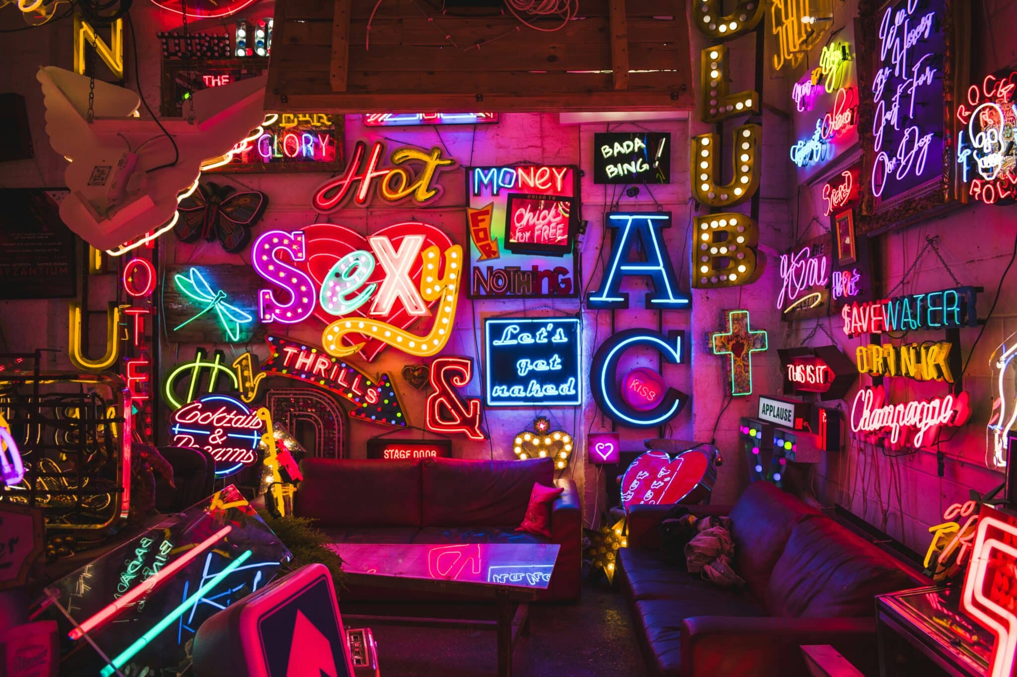
For most of the twentieth century, a glowing tube meant a city after dark and a place that was still open. That history is baked into the glow. A neon sign gets three messages across before anyone reads the copy:
- Open and busy. Lit signage reads as life after dark, which is why late-opening bars have relied on it for decades.
- Made by hand. Skilled craftspeople bent glass tubes, so the look still hints at craft even when the object behind it isn’t glass.
- A specific era. Color and lettering can point to a 1980s arcade or a postwar European café, depending on the brief.
Its advertising past helps as well. Customers already accept neon as a commercial object, so custom neon signs carrying a brand’s own name don’t come across as a gimmick the way a themed mural sometimes can.
Why Younger Customers Buy Nostalgia for Eras They Missed
The surprising part is who’s paying. UK vinyl LP sales rose for an 18th consecutive year in 2025, to 7.6 million units, according to the BPI, and vinyl revenue climbed 19.9% to £174.7 million. The biggest sellers weren’t reissues for aging collectors. New albums from Olivia Dean, Sabrina Carpenter and Sam Fender sat among the year’s top vinyl sellers, and the BPI pointed to the format’s growing appeal with younger fans.
For those buyers, the format itself is the draw. Some in NQ64’s bars are meeting a Nintendo 64 for the first time, with nothing to relive. Neon signs follow that pattern. Someone who never saw glass neon on a high street in its heyday gets no personal memory from the glow. What they get is something analog and slightly stubborn, a break from a day spent on screens.
Brands that pitch nostalgia only at older, wealthier customers miss the bigger audience: people borrowing someone else’s past because it feels more solid than their own.
How LED Neon Signs Made Retro Branding Cheaper to Run
The original look was expensive and fiddly. Traditional neon uses hand-bent glass tubes filled with neon or argon, driven by transformers that step mains power up to several thousand volts, and some colors rely on a small amount of mercury. Tubes crack in transit and need a specialist to repair. Neither suits a leased unit that might change hands in three years.
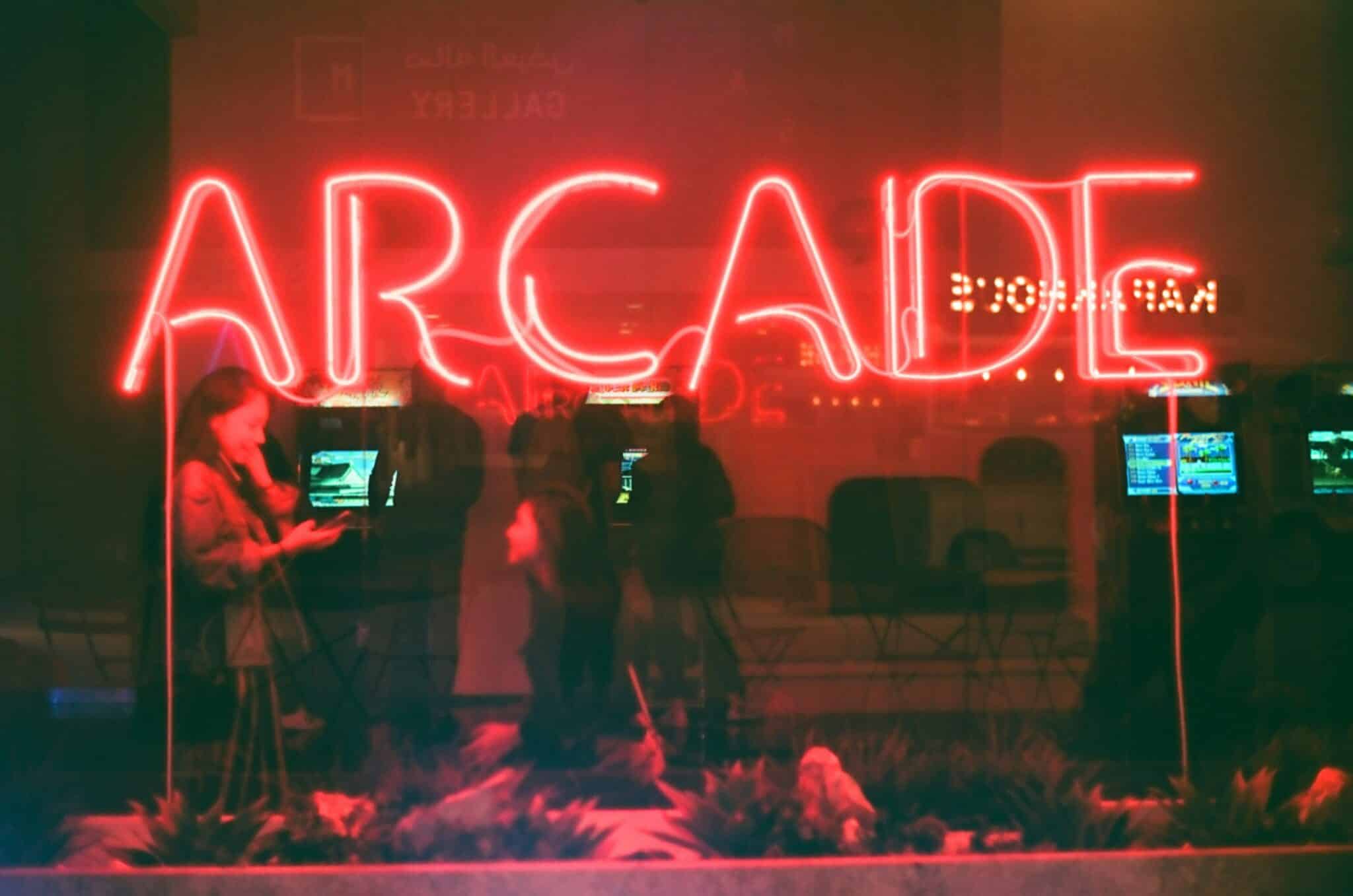
LED neon keeps the look and loses most of the hassle. Rows of small LEDs sit inside a silicone or PVC sleeve that spreads the light into an even line, running on 12 or 24 volts DC. You can cut the flex at marked points and bend it into letters. The color comes from the LEDs themselves, sometimes paired with a tinted jacket, rather than from gas, and the finished piece hangs on a wall like a framed print. Plenty of the signs now going up in bars and shopfronts are built this way.
So retro branding stopped being a capital project. One site can commission a sign in its own wordmark and take it along when the lease ends. Piccadilly Circus swapped neon for screens that rotate advertisers and can react to the weather, but small brands want one message that stays put. A screen can show anything, which is exactly why it says nothing about the past.
Where Nostalgia Branding With Neon Stops Paying Off
Nostalgia has a shelf life, and one of Europe’s biggest consumer brands has watched it run down this year. Adidas rode its Terrace range of Samba, Gazelle and Spezial trainers back to growth, then reported in July that lifestyle footwear was under pressure from heavy discounting, especially in Europe. Chief executive Bjørn Gulden conceded to WWD that everyone knew the terrace boom wasn’t sustainable.
Burger King’s 2021 rebrand has aged better, and the reason is where its nostalgia came from. The agency Jones Knowles Ritchie brought back a logo modeled on the chain’s own identity from 1969 to 1999, then carried it through packaging, menu boards and restaurant signage. Its executive creative director, Lisa Smith, said the goal was to make the brand feel less synthetic and cheap. Burger King went into its own archive. A terrace trainer stocked by every retailer belongs to everyone.
Lighting faces the same test. Neon that keeps earning its spot on the wall usually shares four traits:
- It says something only that business could say. A wordmark, say, or a signature dish. Stock slogans in pink script already hang on countless bedroom walls.
- It frames the product instead of replacing it. NQ64 sells games and cocktails. The neon tells people what kind of night to expect.
- It reads from the street. A sign that still makes sense from across the road after dark does more for a bar than one designed only to be photographed.
- It is used sparingly. One strong piece reads as a character. A room full of them reads as a theme bar, and themes date fast.
None of this turns a glowing sign into a substitute for a product people want. What neon offers is smaller and cheaper: a way for a bar group or a heritage brand to show where it comes from in the second before a passer-by decides whether to come in. Nostalgia will keep cycling through trainers, logos, and record sleeves. The glow tends to outlast each wave, because it was never tied to any one of them.