
































A campaign photograph performs well at home, so the marketing team sends it to five country managers with translated captions. The copy changes. The photograph does not. In one market, the setting feels unfamiliar; in another, the image leaves no useful space for a longer headline. Each local team makes hurried adjustments, and the campaign gradually stops looking like one brand. This is a common creative planning problem, not simply a translation problem. Image tools such as Banana Pro AI offer text-to-image and image-to-image options that may help teams explore alternative visual directions before commissioning or selecting final campaign assets. But technology cannot decide what local audiences find convincing. The useful starting point is to separate what the brand must keep consistent from what a visual needs to change. That allows central and local teams to collaborate without duplicating an entire campaign or forcing every market into the same frame.
The Hidden Assumption Inside a Global Hero Image
Many advertisements assume an everyday scene is universal. A family eating dinner, colleagues meeting after work, or friends spending a weekend outdoors may feel ordinary to the team that commissioned the photograph. The same setting may carry different associations elsewhere. Even without cultural conflict, climate, shopping habits, architecture, and seasonality affect whether an image feels relevant.
Join The European Business Briefing
New subscribers this quarter are entered into a draw to win a Rolex Submariner. Join 40,000+ founders, investors and executives who read EBM every day.
SubscribeConsider a European outdoor clothing brand preparing a spring promotion. A city park photograph might suit one market while another is still experiencing cold weather. Translating the headline will not correct the mismatch. The core promise of reliable everyday clothing can remain stable, but the scene supporting it should fit the local situation.
This does not mean inventing a different identity in every country. It means checking the assumptions behind the image before rollout. Ask local teams what feels familiar, which products are actually available, and what seasonal conditions customers are experiencing. These questions are more productive than asking whether they simply “like the creative.”
Separate Brand Constants From Local Decisions
A practical brief should have two columns. The first holds elements that remain fixed: brand voice, approved color use, product facts, and the customer promise. The second holds elements open to local judgment: setting, people, seasonal cues, composition, and the amount of space reserved for copy.
For an insurance brand, trust and clarity may be constants. The accompanying scene might change between a small urban business, a family home, and a regional service office. Those are hypothetical creative contexts, not evidence that one culture prefers a particular image. Local reviewers should choose what actually reflects the audience they serve.
Treat copy length as part of the visual brief. Translated headlines rarely occupy identical space, even when their meaning matches. A campaign image with text placed over a crowded background may become unusable when the headline grows. Building alternative crops and quieter areas into the visual direction is easier than trying to rescue the layout after translation.
Three Local Checks to Run Before Producing the Campaign
- Check the Situation, Not Just the Faces
Localization is often reduced to changing the people in a photograph. That is a shallow test. Ask whether the activity, environment, product use, and time of year make sense. A winter travel offer shown against a bright summer scene may confuse customers regardless of who appears in it. Have a local marketer describe what the audience would recognize immediately and what would require explanation. Avoid treating nationality as a visual stereotype. Regional relevance comes from real customer circumstances, not costume changes or generic landmarks.
- Check Whether the Layout Survives Translation
Give the visual to someone working with the actual translated copy. Ask them to place the headline, legal wording, and call to action at usable sizes. A photograph that looked elegant with four English words may fail with a longer equivalent. Build deliberate negative space, meaning an uncluttered area where text remains readable. Test mobile crops as well as wide desktop placements. This catches layout failures before the campaign is adapted by several different agencies under deadline pressure.
- Check Whether the Promise Still Looks Honest
Images communicate claims even when the copy stays cautious. An illustrated service experience may imply a facility, product feature, or level of support that a company does not offer locally. Have regional teams verify the practical details. Is that product sold there? Is the depicted service actually available? Does the scene imply an unrealistic result? If a visual changes the promise, it is no longer a harmless adaptation. Fix the discrepancy before polishing the look or requesting approval.
Use Image Variations as Questions for Local Teams
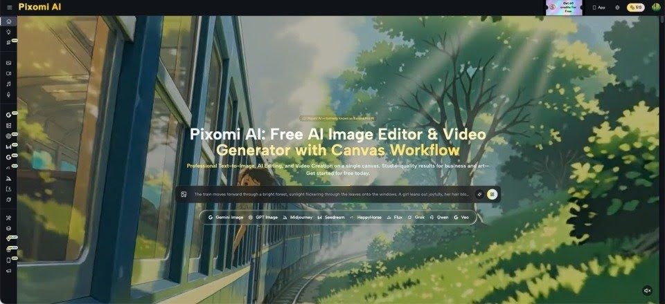
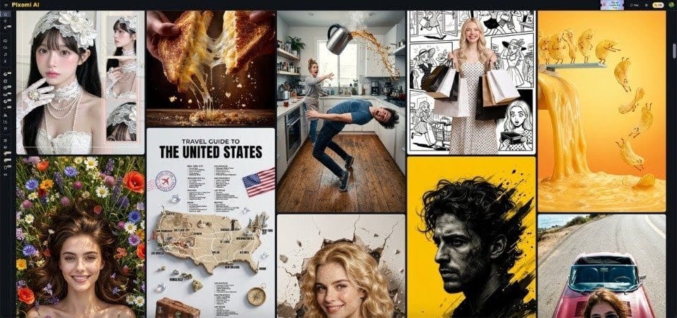
Instead of presenting one supposedly universal hero image, a central team might develop three provisional routes: a people-focused scene, an environment-focused scene, and a simpler composition that gives translated copy more room. With Pixomi’s publicly described image-generation and transformation capabilities, Nano Banana Pro is one option for exploring image directions as part of an early creative review. Such outputs should be labeled as concepts until their factual details and rights have been checked.
The review should produce decisions, not a popularity contest. Ask local colleagues which route communicates the intended benefit, what feels unrealistic, and what needs to remain unchanged. Collect reasons alongside preferences. If two teams reject the same concept for different reasons, that distinction matters.
For major campaigns, selected references should move into normal production: approved photography, precise product imagery, professional retouching, and documented sign-off. Generated examples help clarify a brief. They do not eliminate the need for accountable final production.
Keep a Simple Record of What Changed and Why
Without documentation, localization becomes an endless collection of almost-matching advertisements. Use a shared sheet recording the market, proposed change, reason, reviewer, and approval status. Include the version of the headline and which product or service is pictured. That information helps central teams distinguish necessary adaptation from personal taste.
There is a useful cost comparison here, but it should remain qualitative unless your organization has measured its own numbers. Reworking an image late can involve new photography, further approvals, and more coordination. Exploring options early can reduce avoidable debate, yet AI output itself may require substantial review and correction. Neither path guarantees lower costs in every project.
Most importantly, keep an accessible source of truth for product accuracy, licensing, and brand rules. A local team should not need to reverse-engineer those obligations from an attractive sample. Creative flexibility works best when the non-negotiable facts are easy to find. A brief monthly check-in between regional marketers also helps the central team learn which adaptations deserve to become standard options for future campaigns.
Conclusion
A successful international campaign does not require every customer to see the exact same photograph. It requires the same credible promise to survive different languages, settings, and practical expectations. Begin by naming the visual elements that must remain consistent, then give local teams room to challenge assumptions about context, season, and layout. Use provisional image variations to make these conversations concrete, but verify the details before anything goes live. Even a modest review with three well-chosen questions can prevent a polished campaign from feeling oddly foreign to its audience. The aim is neither perfect uniformity nor endless customization. It is a brand that stays recognizable while looking relevant in each market. Before the next rollout, show local reviewers the image without its headline and ask what story they think it tells.